Changing the structure of a worksheet |
Previous section: Importing data
This topic contains the following sections:
- Transposing a worksheet
- Decompose a table with a cycling independent variable
- Convert X-Y-V columns to a matrix
Sometimes it is necessary to exchange data rows and data columns. This operation is called transposing a table. To do it, make the worksheet you want to transpose the active document and then choose Worksheet→Restructure Worksheet data→Transpose from the main menu. A dialog opens (see figure below).
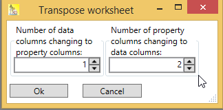
You can specify the number of data columns to convert to property columns, and you can specify the number of property columns that will be converted to data columns. If you want to do only a simple transpose of all data columns, set both numbers to zero.
The figure below shows a worksheet before (left side) and after transposing (right side), choosing one data column to convert into a property column and two property columns to convert into data columns. Note that in this worksheet all data columns and property columns of type TextColumn.

The one data column that is converted to a property column is marked green. The two property columns which become data columns are marked with blue and purple. The other data rows (I have marked only column 1 and 2 become data rows in the transposed worksheet.
Please note that transposing a worksheet works best if all columns are of the same type. Otherwise some loss of data can not be avoided.
Consider the following worksheet:
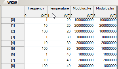
This data could have been produced by a measurement device, varying the measurement frequency (data column 0), and the temperature (column 1). The measured values are the real and imaginary part of the modulus in columns 2 and 3.
Obviously, in the given form, if you try to plot the data (Modulus.Re) versus frequency, you will get a scrambled result:
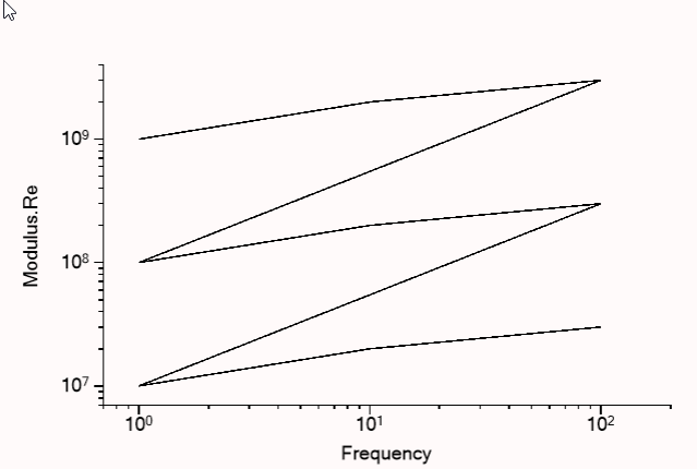
This is because the frequency is repeated three times: (1, 10, 100, 1, 100, 100 and so on). I call the frequency here ‘cycling independent variable’ because it cycles between a set of values (1, 10, 100).
What you really need are separate columns for the modulus, one for each temperature (if you want to plot modulus versus frequency), or one for each frequency (if you want to plot modulus versus temperature).
If you have separate columns of the modulus for each temperature, you can plot them much more nicely that in the example above. Furthermore, you can show the temperatures that belong to each column in the legend:
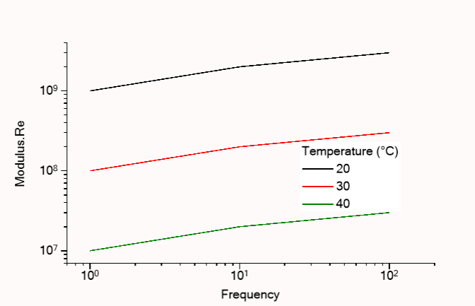
This kind of restructuring can be achieved with the command:
Worksheet→Restructure Worksheet data→Decompose table with cycling indep. Var'''
from the main menu.
Before you issue this command, select all columns that you want to have in the new worksheet, including the cycling variable (here: Frequency) and the second independent variable (here: Temperature).
For the next examples, I had always selected all four datacolumns in the original worksheet.
A dialog appears:
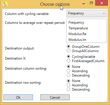
Make sure that the column with the cycling variable is selected in the first combo box. In the list box labeled ‘Columns to average over one repeat period’ you should select the second independent variable, which here is the column ‘Temperature’. The next choice (‘Destination output’) is about how to group the remaining columns in the destination worksheet. ‘Destination X’ let you choose the cycling variable as the new x-column (here: if you want to plot modulus versus frequency), or the first averaged column (here: if you want to plot modulus versus temperature). The remaining options concern the sorting of the columns and rows in the destination worksheet and should be self-explanatory.
With the data above, I chose ‘GroupOneColumn’ for destination output and ‘CyclingVariable’ for Destination X (see figure below).
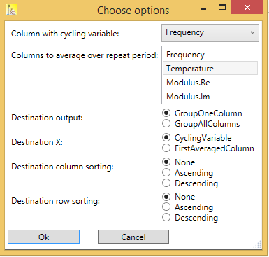
The resulting worksheet look like this:

As you can see, ‘Frequency’ is the X-column of the resulting worksheet, and this column no longer contains repeated values. The temperature has become a property of the other columns; it is now a property column. By the option ‘GroupOneColumn’ first the three ‘Modulus.Re’ columns appear in the new worksheet, and then the three ‘Modulus.Im’ columns, one column for each temperature (to be exactly: for each cycle of the frequency).
In contrast to that, consider the following options:
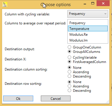
Here I have chosen ‘GroupAllColumns’ for destination output and ‘FirstAveragedColumn’ for Destination X. The outcome of this options is:

As you can see, now ‘Temperature’ is the x-column of the resulting worksheet. The frequency has become a property of the other columns, since it is now a property column. By the option ‘GroupAllColumn’ all other columns (Modulus.Re and Modulus.Im) are repeated for the first frequency (1), then for the next frequency (10), and finally for the last frequency (100).
Consider the following worksheet from the previous chapter:
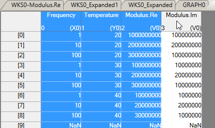
Note that I here marked column 1 (‘Temperature’) as y-column (by using Column→Set column as Y from the main menu). Then I selected column ‘Frequency’ (x-column), column ‘Temperature’ (y-column) and column ‘Modulus.Re’ (V-column).
After using Worksheet→Restructure Worksheet data→Convert X-Y-V to matrix the following worksheet results:
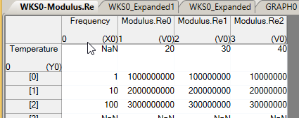
As you can see, the Modulus.Re values are arranged ‘matrix-like’ in columns 1, 2 and 3. The x-column is still column 0 (‘Frequency’). And the former y-column ‘Temperature’ has become a property column with the same name. You can use such a ‘matrix-like’ worksheet for instance to make a density plot.
Next section: Worksheet Notes