Quickstart |
The most commonly used graph is a line, scatter, or line-scatter graph. You typically have multiple data points, consisting of an x-value and an y-value (attention: in Altaxo the y-values are called v-values, because y is reserved as second independent variable for 3D-plots). Both x and v values are numerical values. Assume, for instance, that you have watched a car during acceleration and measured the distance (in meter) the car has travelled so far at different times (in seconds). You may have then the following worksheet:
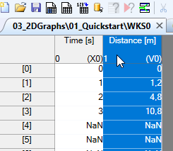
Here, I already have selected the column Distance [m]. This column is tagged as v-column, as can be seen in the lower right corner of the column header (you see a (V0) there, because 0 is the group number of the column). Important: Do not select the x-columnTime [s]. Since this column is already tagged as x-column (X0) in the lower right corner of the column header), it is automatically used when the line/scatter/line-scatter plot is created.
You can then click one of the following icons from the toolbar:
creates a line plot creates a scatter plot creates a line-scatter plot.
Alternatively, you can choose from the main menu Plot, and then one of the menu items Line, Scatter, or Line_Scatter.
That's all! The look of the graph that is created depends on the template you have set.
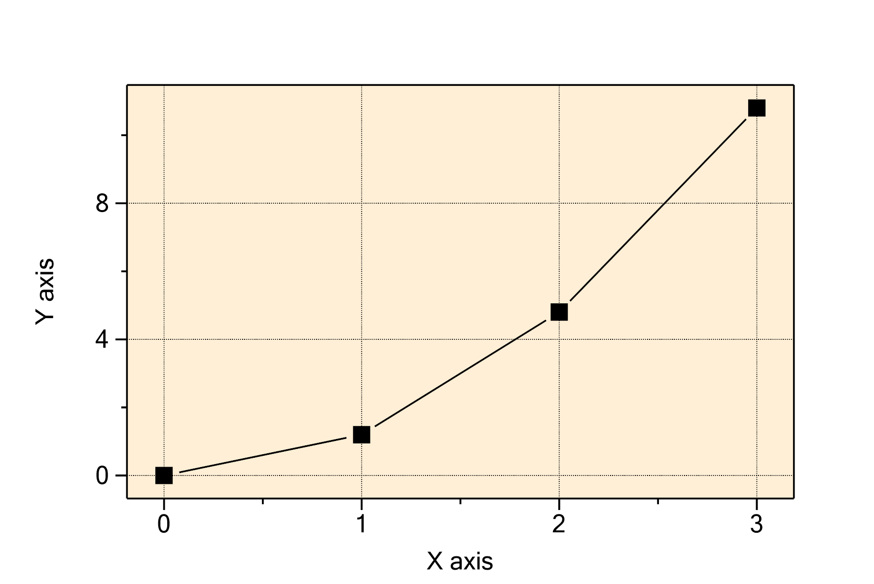
If no template has been set, the result, for instance for a line-scatter plot, may look like this:
If you have a template set, the result depends on your template. For me, it looks like this:
A density plot is something similar to a 3D-plot. Unlike a 3D-plot, the z-axis is not shown as height, but is coded as color values.
Create some data (or use your own)
Since it is difficult to get data for a nice density plot, we create them by a worksheet script.
The classical example for this is to show the function
Create an empty worksheet, and then open the worksheet script dialog by choosing from the main menu Worksheet → Worksheet script. Enter the following script text (you can copy it from here):
for (int i = 0; i < 64; ++i) // index of columns
{
    var currentColumn = col.EnsureExistence("F" + i.ToString(), typeof(DoubleColumn), ColumnKind.V, 0);
    double y = (i - 32)/2.0;
    for (int j = 0; j < 64; ++j) // index of rows
    {
        double x = (j - 32)/2.0;
        double f = Sin(Sqrt(x * x + y * y)) / Sqrt(x * x + y * y);
        currentColumn[j] = f;
    }
}
Press the OK button of the script dialog to get the script executed. It creates 64 columns, named F0 .. F63, and fills the table cells with values according to the function above, using 64 rows. Essentially, the result is a matrix of 64 columns x 64 rows.
Plot the data as density plot
Now, press CTRL-A in order to get all columns of the worksheet selected, and then choose from the main menu Plot → Density plot.
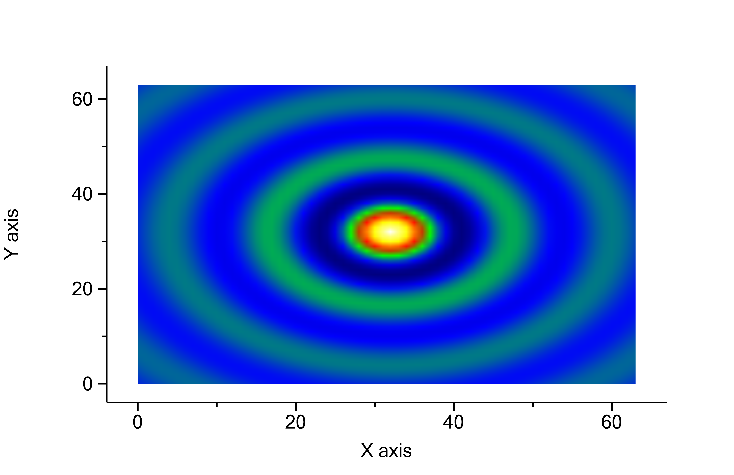
The result should look like this:
Improved example
Because of the simplicity of the above example, some important things are missing here. The most obvious is that our x and y axis values range from 0 to 64 (borders of the image), but the x and y we calculate in the script range from -16..16. In fact, we have never stored the x- and y-values!
An improved version of the script above is this:
col.RemoveColumnsAll();
pcol.RemoveColumnsAll();
var yCol = pcol.EnsureExistence("Y-values", typeof(DoubleColumn), ColumnKind.Y, 0);
var xCol = col.EnsureExistence("X-values", typeof(DoubleColumn), ColumnKind.X, 0);
for (int i = 0; i < 64; ++i) // index of columns
{
    var currentColumn = col.EnsureExistence("F" + i.ToString(), typeof(DoubleColumn), ColumnKind.V, 0);
    double y = (i - 32) / 2.0;
    yCol[col.GetColumnNumber(currentColumn)] = y;
    for (int j = 0; j < 64; ++j) // index of rows
    {
        double x = (j - 32) / 2.0;
        double radius = Sqrt(x * x + y * y);
        double f = radius == 0 ? 1 : Sin(radius) / radius;
        xCol[j] = x;
        currentColumn[j] = f;
    }
}
In the first two code lines, we remove all existing data columns and property columns. Then, in the next two code lines, we create a property column yCol named Y-values and a data column xCol named X-values, which store the respective y and x values. The assignment of the x values to xCol is straightforward (xCol[j] = x;). The assigment of the y values to the property column yCol by yCol[col.GetColumnNumber(currentColumn)] = y; is a little involved, since we have to find the right index first (in fact, it would be i+1, with the added 1 because we have an additional column X-values now at the beginning of the worksheet), but here I wanted to demonstrate the clean way to do it.
The resulting worksheet should look like this:
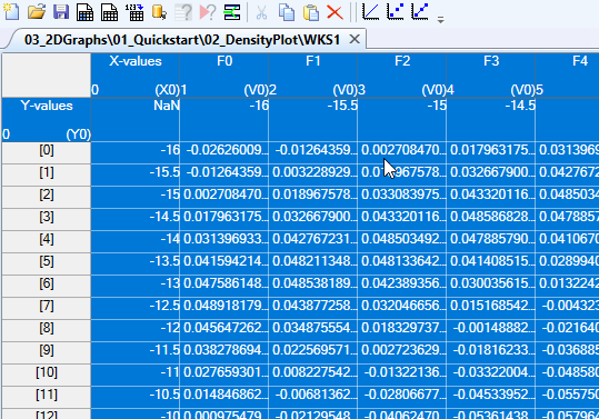
In the worksheet above, I have already selected all data columns, including the column X-values, using CTRL-A, and then, while still holding the CTRL key, I clicked onto the property column header of the Y-values property column (that is the cell with the Y-values text in it) in order to select it, too.
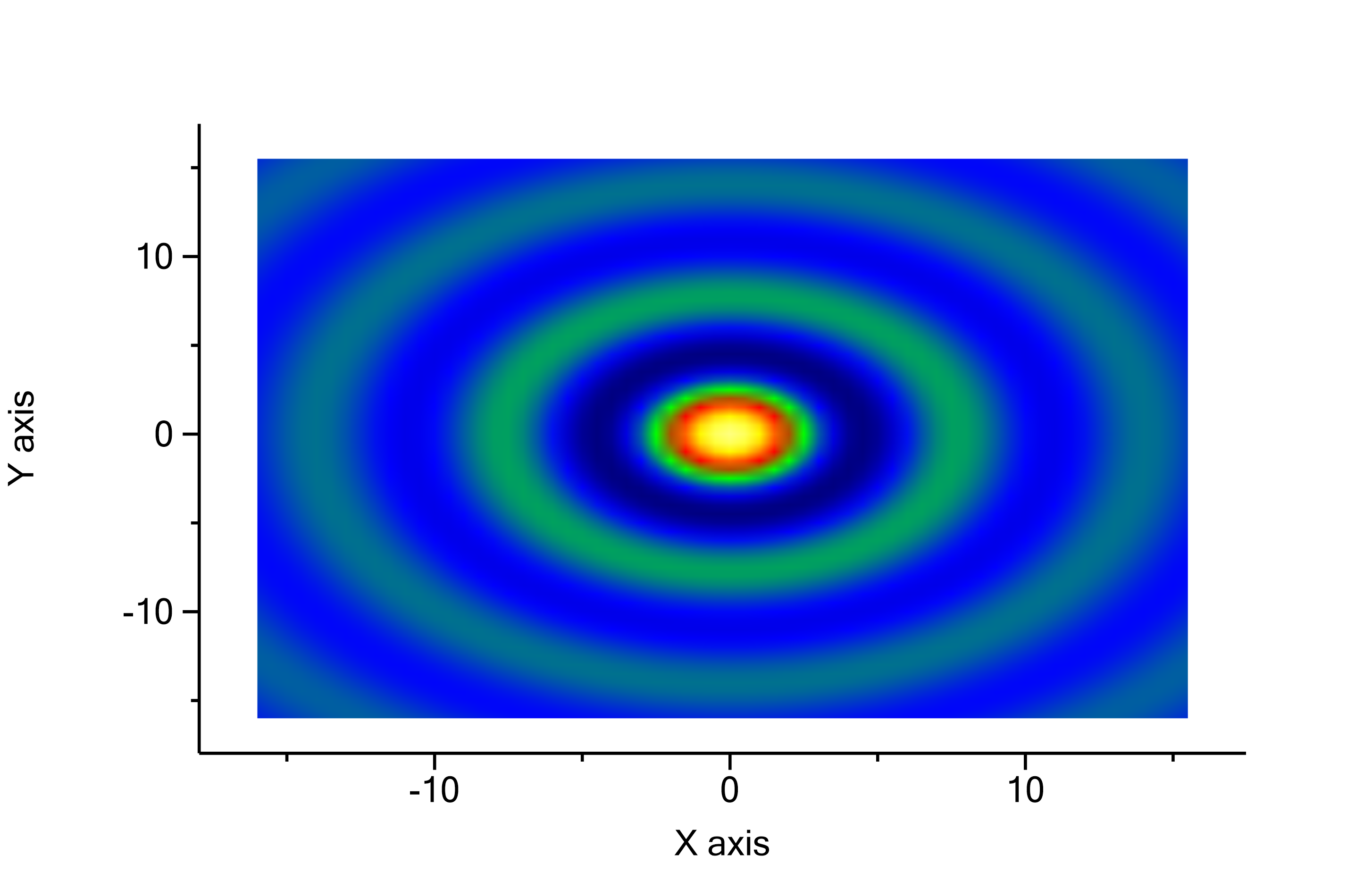
Now again, use from the main menu Plot → Density plot to get the density plot, show in the following graph:
Now, the range of the x values is as expected from -16 to 16, and the range of the y-values is the same. Also, the white dot in the middle has disappeared, since the condition, that the radius ![]() is zero, has been treated properly by setting
is zero, has been treated properly by setting ![]() then.
then.
Next section: Concepts

