Quickstart |
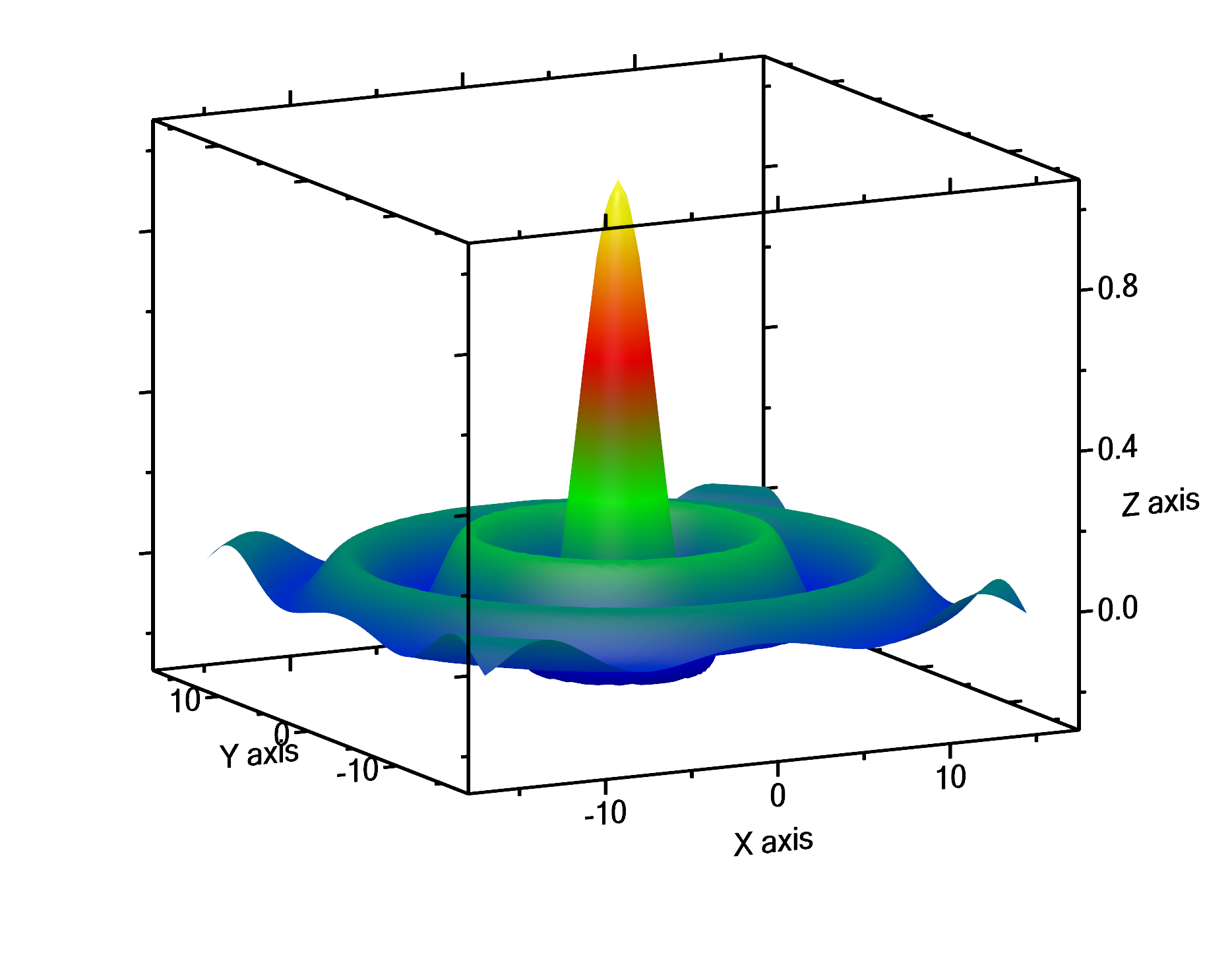
A surface plot is a 3D-plot, which uses a 2D matrix of values. The values designate the height of the surface above ground level. This is similar to a 2D-density plot, in which the z-values are coded as different colors of the plot.
Create some data (or use your own)
Since it is difficult to get data for a nice surface plot, we create them by a worksheet script.
The classical example for this is to show the function
Create an empty worksheet, and then open the worksheet script dialog by choosing from the main menu Worksheet → Worksheet script.
We use here the same script as already shown in the advanced example in the quickstart section of the 2D-density plot.
Enter the following script text (you can copy it from here):
col.RemoveColumnsAll();
pcol.RemoveColumnsAll();
var yCol = pcol.EnsureExistence("Y-values", typeof(DoubleColumn), ColumnKind.Y, 0);
var xCol = col.EnsureExistence("X-values", typeof(DoubleColumn), ColumnKind.X, 0);
for (int i = 0; i < 64; ++i) // index of columns
{
    var currentColumn = col.EnsureExistence("F" + i.ToString(), typeof(DoubleColumn), ColumnKind.V, 0);
    double y = (i - 32) / 2.0;
    yCol[col.GetColumnNumber(currentColumn)] = y;
    for (int j = 0; j < 64; ++j) // index of rows
    {
        double x = (j - 32) / 2.0;
        double radius = Sqrt(x * x + y * y);
        double f = radius == 0 ? 1 : Sin(radius) / radius;
        xCol[j] = x;
        currentColumn[j] = f;
    }
}
Press the OK button of the script dialog to get the script executed. It creates one x-column X-values, plus 64 data columns, named F0 .. F63, and fills the table cells with values according to the function above, using 64 rows. Essentially, the result is a matrix of 64 columns x 64 rows. Additionally, one property column, Y-values, is created to hold the y-values.
Plot the data
The resulting worksheet should look like this:
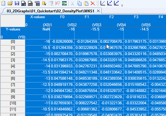
In the worksheet above, I have already selected all data columns, including the column X-values, using CTRL-A, and then, while still holding the CTRL key, I clicked onto the property column header of the Y-values property column (that is the cell with the Y-values text in it) in order to select it, too.
Now use from the main menu Plot → 3D-Plots → Plot3DSurface to get the surface plot, show in the following graph:
Start enjoying the scene by pressing the middle mouse button while in the graph and then moving the mouse in order to rotate the graph. You can also zoom in and out by scrolling the mouse wheel. The additional red lines that appear in your graph, but does not appear in the figure above, are intended for your orientation and for showing the final boundaries of the graph.
You can also use the lighting panel to modify the lighting of the scene. Play around!
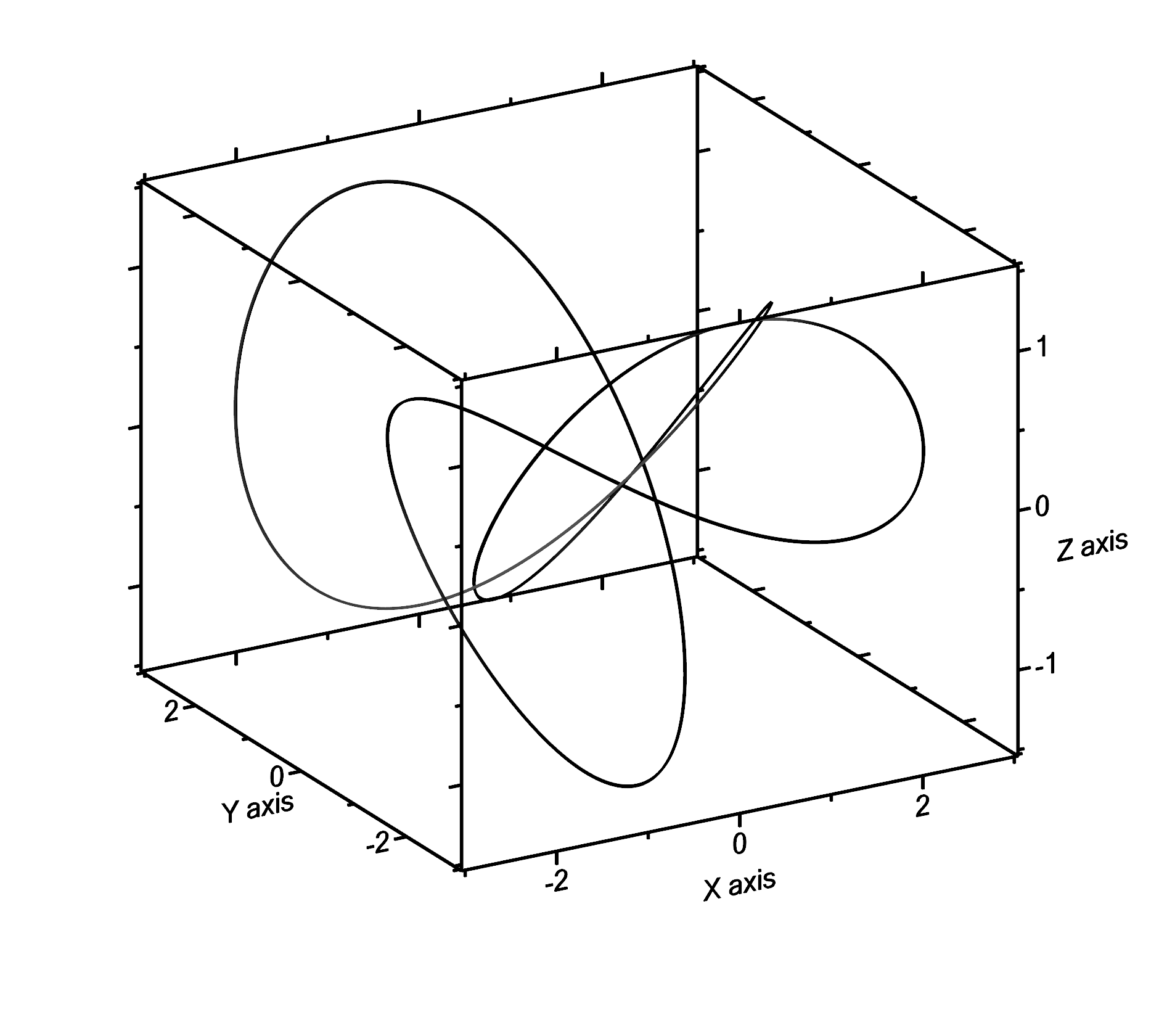
A 3D line plot is, as is already suggested by the name, a plot of a line in 3D space. As such, in order to plot a line, we need a sequence of points in 3D space, that becomes connected then by a line. Each point consists of 3 values: x, y, and z.
Create some data (or use your own)
Knots are nice examples of lines in 3D space. We visit the web site of Paul Bourke to find out the formulas that are necessary to model knots in 3D space. In particular, we use the Knot2 from this web site for our example.
The x, y, and z values in this example are varied according to the following equations:
Create an empty worksheet, and then open the worksheet script dialog by choosing from the main menu Worksheet → Worksheet script.
We use here the same script as already shown in the advanced example in the quickstart section of the 2D-density plot.
Enter the following script text (you can copy it from here):
col.RemoveColumnsAll();
var xCol = col.EnsureExistence("X values", typeof(DoubleColumn), ColumnKind.X, 0);
var yCol = col.EnsureExistence("Y values", typeof(DoubleColumn), ColumnKind.Y, 0);
var zCol = col.EnsureExistence("Z values", typeof(DoubleColumn), ColumnKind.V, 0);
for (int i = 0; i <= 1024; ++i) // index of columns
{
    var mu = (2 * PI * i) / 1024; // range of mu: [0, 2π]
    xCol[i] = (4 * Cos(mu + PI)) / 3 + 2 * Cos(3 * mu);
    yCol[i] = 4 * Sin(mu) / 3 + 2 * Sin(3 * mu);
    zCol[i] = Sin(4 * mu) + Sin(2 * mu) / 2;
}
The first line of the script removes all existing columns from the table. The next 3 lines create the x, y and z column. Then a loop from i=0 to 1024 is started, in which the variable mu varies from 0 to 2π. The values for x, y and z are then set according to the formulas given on Paul Bourke's web site for Knot2.
Plot the data
The resulting worksheet should look like this:
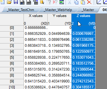
In the worksheet above, I have selected the column containing the z values. Do not select the other columns, since they are already tagged as x column and y column (see the X0 or Y0 in the lower right corner of the column header).
Now use from the main menu Plot → 3D-Plots → Line to get the line plot, shown in the following graph:
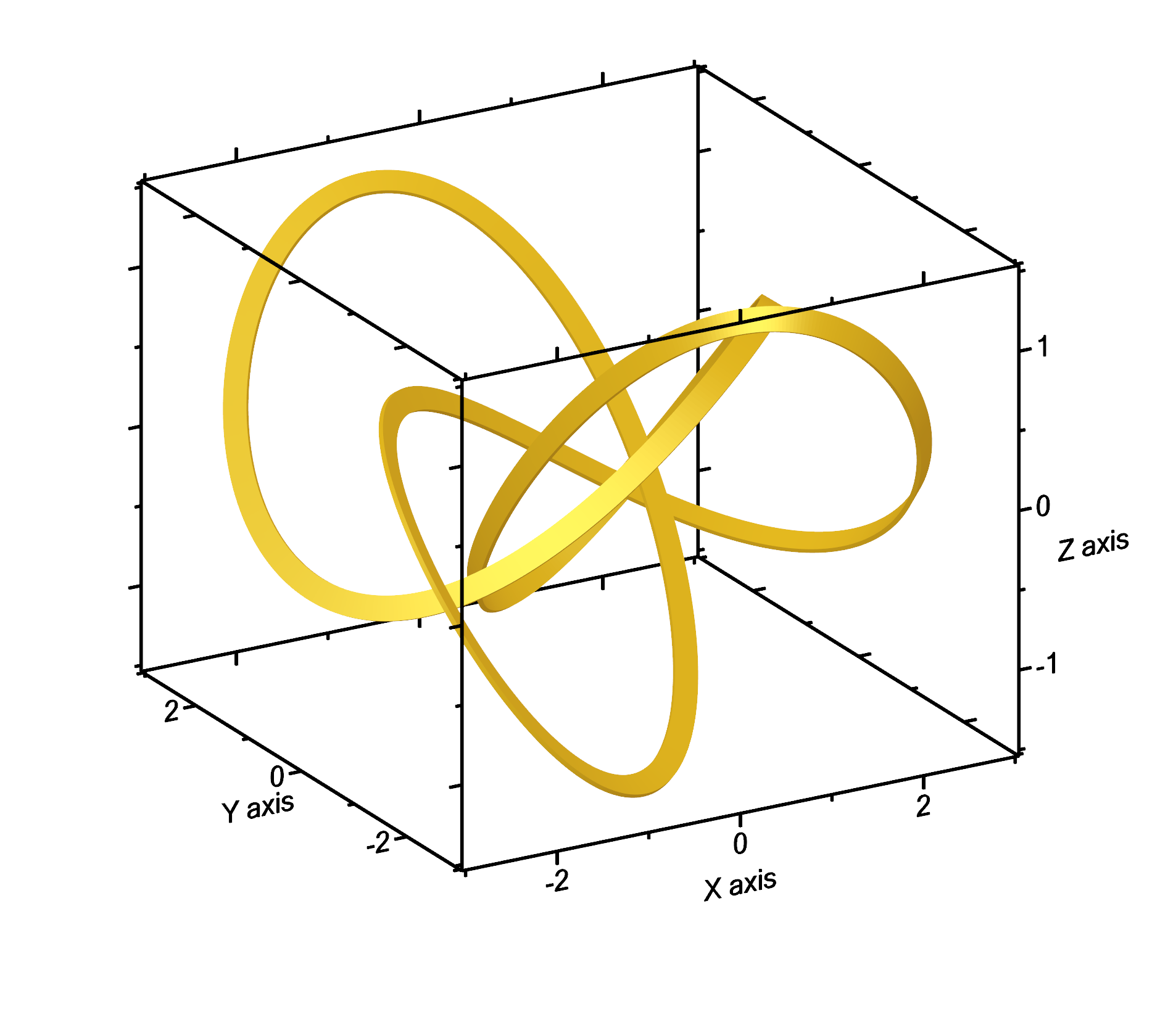
This could look even better when modifiying the line widths to 10 and 2, and playing a little with the light:
Next section: Text documents - Markdown in Altaxo
